
“Roughly one-in-five U.S. adults (21%) say they regularly wear a smartwatch or wearable fitness tracker, according to a Pew Research Center survey conducted June 3–17, 2019.”
If we correlate the life before and after the pandemic, we can witness that people are more likely to focus on personal health, fitness, and hygiene now. ‘Wearables’ is one area that is helping the world in maintaining the streak. In recent days Fitness Bands, Smartwatches, VR, Smart Clothing, Ear Buds, and many other new wearable technologies came into existence. But let's focus on Smartwatch for today.
This article today is solely from my personal experiences, in conjunction with principles from Android Wear OS, Apple Watch OS, and Samsung’s One UI.
Why do we need a smartwatch anyway?
- First, what time is it?
- Incoming call and want to know who it’s from?
- A text has arrived; is it worth dealing with?
- How many calories did I burn today?
- “Hey, Siri. How much is $1 in India?”
- Argh. The smartphone is distracting anyway.
This isn’t it, we can do a lot more based on your watch capabilities. Few watches can even track your Pulse, SPO2, Blood Pressure, etc.
Let’s dive deep into our actual topic now— “Your guide to Smartwatch Interface Design”.
The Guide
No masterpiece is created just from an idea, each of them needed enough homework before they start. Yet here I’m, helping you with ‘your’ homework. I’ve curated a list of items for you to focus on while creating your next masterpiece. These list items are brought together with respect to three simple principles. Design, Accessibility, and Ease-of-use. Let’s see what these three principles had to teach us while designing a smartwatch.
1. The Real-estate & Layout
Considering the Apple Watch 40mm screen size, it is 40.2% smaller than iPhone8. Designing something for such a smaller resolution and making everything look legible would be a critical job for any designer. Yet, companies across the globe leveraging this opportunity to make life easier for people (and Make money out it, but that’s not our topic today).
2. Gestures
One thing everyone would expect from such a smaller screen is ‘Ease of Access’, but how do we achieve that?
Yes, we don’t usually think of gesture-based navigation while designing for a smartphone, but it is a good idea to consider gestures coming to a smaller screen real-estate like a smartwatch. For example, ‘Swipe right to go back’ from Apple can save us space for ‘Back’ action in every single screen of the watch, and it is effective too.
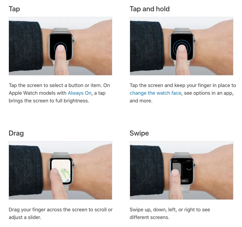
3. Back action
As said above, ‘Swipe to go back’ is not just an example but it’s a solution to make life easy. Inspired by Apple’s swipe right to go back, android implemented this gesture as a replacement for the soft keys at the bottom of the screen in their OS. Not sure what I’m talking about? check the image below.
Having similar gestures on your smartwatch can help you switch between pages or apps very easily. It also saves the number of physical button clicks(if there exists any).
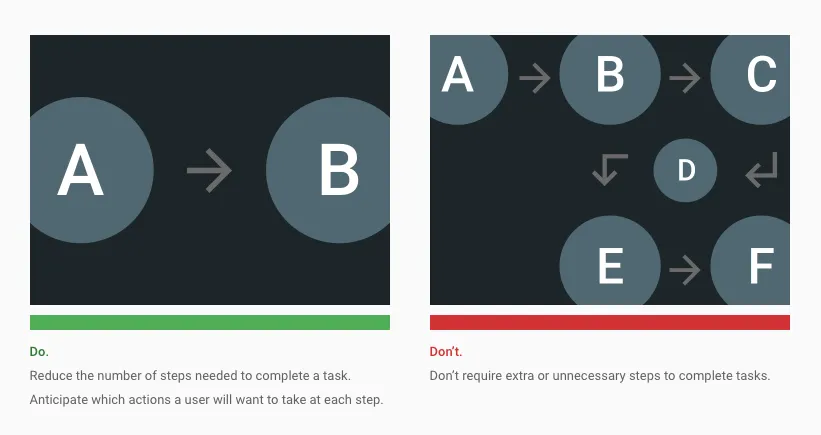
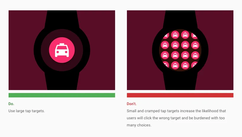
4. Limited actions on screen
Cut to the point!
Your research might tell you that “this, that, this, that, everything is our primary action”, but still narrow it down to one or two. This helps the user to select the right thing at the right point in time with no fuss.
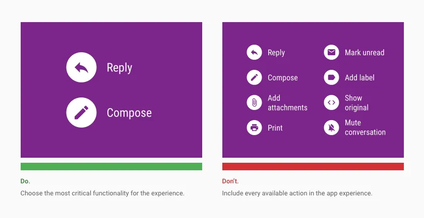
On a smaller real-estate like a smartwatch, it is difficult to accommodate space for everything in one room. If we do so, that might lead users unable to focus on what’s important. It may also lead to confusion, irritation, frustration, and let the user look for a wall to bang their head, which we don’t want to happen.
“A user never complain if their expectations are not on screen but they definitely regret if something is there and it’s not accessible”.
5. Avoid complex functionalities or user flows
Avoid creating hierarchies deeper than two or three levels. Shallow hierarchies make it easier for people to find what they want quickly. Including more than two or three levels of information might cause people to lose their place during navigation.
6. Recover from unintentional actions
Considering the place where the watch is located on human body, there are high chances for unintentional actions on the screen. To avoid such actions or allow the user to recover from such unintentional actions, it is suggested to use gestures like ‘Tap and hold’ to complete critical actions or in some cases, a simple ‘Undo’ action can do the trick.
7. Margins & Paddings
“Law of proximity, a law from Gestalt Laws of Grouping, states that objects that are near, or proximate to each other, tend to be grouped together and perceived as one family”
Grouping helps users understand and organize the information faster and more efficiently. In the UI it can be achieved with the help of margins and paddings between components.
In other words, this breathing space around the UI elements is crucial to make a design ergonomic and helps your design work just as you intended to.
8. Buttons & Actions
While designing buttons avoid using color as the only way to show interactivity. WatchOS uses a rounded rectangle shape as the primary way to indicate interactivity for buttons and lists. This will ensure people with color blindness will perceive the information same as any other user. Besides, the utilization of more colorful elements on the screen impacts battery life.
9. Typography
On other platforms like smartphones or on the web, you are allowed to play with a variety of fonts. But when it comes to a smartwatch you must pick your fonts wisely. Wrong font choices may leave a greater impact on your designs. For example, Montserrat has wide letters that cover more screen for less info, because of which you cannot showcase all your most needed information in one shot.
It is better you don’t look for any fancy or serif types, as they are less legible on smaller screens. Try using some Sans font families like Roboto, SF Text, Helvetica which offer better font tracking and sizes. These font families offer a variety of styles that fit all your needs.
Anyhow, you must let your creative juices flow in terms of fonts when its time for you to create watch faces.
10. Colors
One of the primary objectives of any smartwatch is to scan the info at a glance. To make the information pop well under different light conditions, it is suggested to use bright colors that are easy to perceive and make the text legible.
A well-defined color palette not only aids your branding, but it also creates a visual continuity between different screens. Here are three key principles you must remember while using colors:
- Consider context. Make sure the colors you choose sends the appropriate message. For example, it would be jarring if an app for mindfulness used a vibrant red color as a background color during meditation.
- Consider contrast. Apple recommends using light colors for text because it’s easier to achieve proper contrast and legibility with such colors.
- Consider color blindness. Many colorblind people find it difficult to distinguish red from green. Do not use these color combinations as the only way to deliver the message.
Google uses monochromatic color palettes that help differentiate elements on the screen. Google says “Darker backgrounds are more suitable for social environments as they make screens less obtrusive”. Even when used in OLED displays, darker colors also better preserve battery life.
11. Micro Interactions
Micro-interactions creates a more natural experience by adding a new level of depth to the interaction design. Micro-interactions includes icon animations, page transitions between views, button animations, and all other interactive elements.
Micro-interactions are the only powerful design elements that can deliver natural emotions through design. For example, animated icons for ‘files dropped in a bin’, ‘files uploaded successfully’, etc. In other words, smoother the interactions, smoother the experience.
Researchers have discovered that the optimal speed for interface animation is between 200 and 500 ms. Any animation shorter than 100 ms is instantaneous and won’t be recognized at all.
If you think having a lot of micro-interactions can enhance the user experience, then you are wrong. Animations or micro-interactions should be as subtle as possible to make the experience seamless. If you are keen on motion design, I suggest this good read from Adobe on motion design.
12. Haptics (Vibration feedback)
Having micro-interactions on-screen makes the UI feel seamless, but what if your user is color blind or needs some accessibility features?
That’s when “haptics” comes into the scene, to give that personal touch from the device. Apple has already curated a set of meaningful haptics for you, you can check them out here. If you’re interested in learning more about haptics, I have one whole article that covers everything you must know about Haptics.
Ensure your haptic behaviors won’t conflict with the system behaviors, your user doesn’t want to hear a ‘Boo👎 ’ on a success alert!
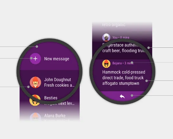
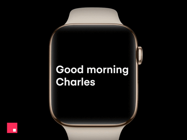
13. Alerts
As a user, I should be able to manage my alerts from different apps. I don’t want to see my hand buzzing for each stupid notification. Correct?
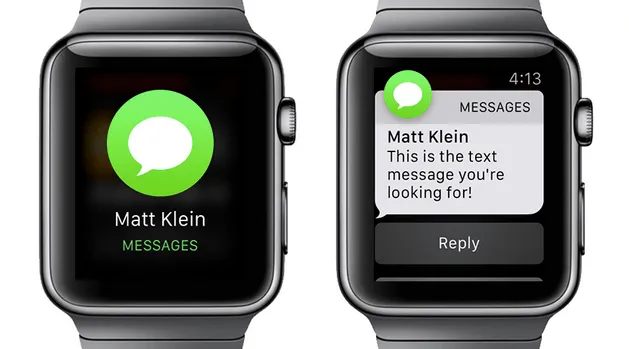
In the above image, Apple thought the most important info we need to know when we receive a notification is:
- From which app?
- From whom?
Whereas on a mobile phone we might even want to see,
- From which app?
- From whom?
- When was it sent?
- What does the message say?
- Actions to take, etc.
I think Apple did it right. A normal user never says ‘No’ if you want to show more useful info, but if you want to keep it limited, he won’t complain either.
Always design your UI for the alerts as simple as possible. Because it is content we are focusing on, not design. Just cut the crap I say.
14. Inputs
Since the screen real-estate on the smartwatch is very small, it will be difficult for users to type something with that built-in keyboard(if any). To keep the experience going in a positive direction, it is better to minimize the use of the built-in keyboard and take the inputs in form of dropdowns or multiple selections on the screen.
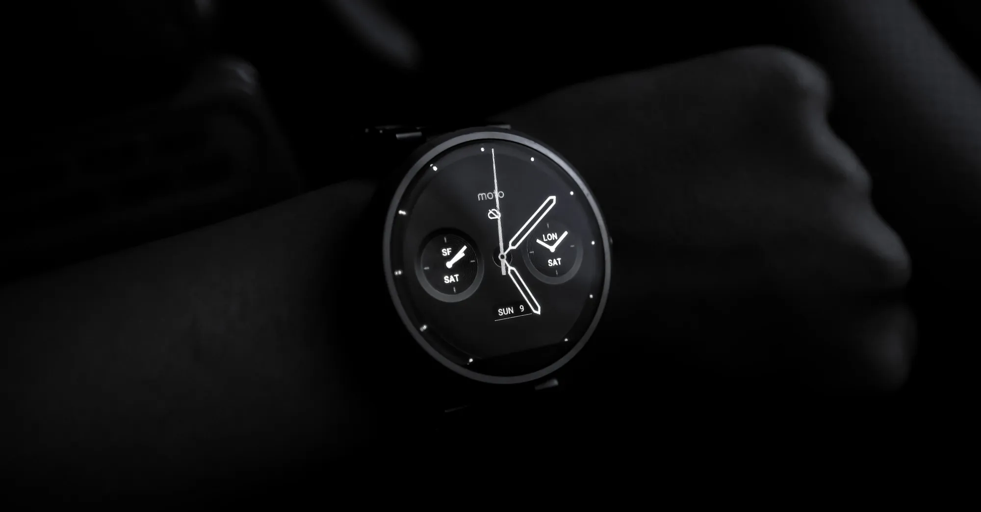
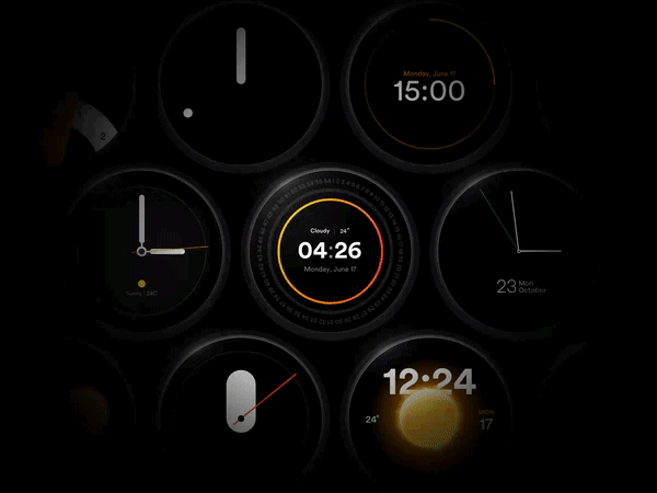
15. WatchFaces
Go Wild!
While designing a watch face you can’t limit your creativity, but you must limit the data that you need to present on a watch face. The information should focus on what the user wants to see at a glance. Here are a few things Apple and Google show on their watch faces.
- The first is Time & Date obviously.
- Missed notifications count.
- Player controls if music is playing.
- Pulse Rate
- Weather
- Fitness metrics such as calories, distance, steps, etc.
- Device connectivity
- Battery Status
Simple informal research within your friends' circle or colleagues can give you more insights into what your users would normally expect from their watch. If it doesn’t help you can always get inspired by Google or Apple, who already did enough research for us.
16. Screen Specifications
Not every screen is capable of rendering your designs and colors accurately. Few render incorrect colors, and others don’t aid optimal refresh rate. Screens with poor screen refresh rates will fail to render those cool animations you’ve designed for your project.
Always verify device capabilities before starting with the designs. This helps you understand the limitations of the device hardware.
Test your designs
Food on your plate might look delicious, but can you guarantee the same with its taste?
No right. Likewise, your designs may look awestruck on your design tool but might not perform well on a real watch. Always ensure you test them on a watch with a preview tool or maybe with just images, before sending it to your developers.
Suggestion: This one is out of my personal experience. On your design tool always try to keep the zoom level at 100% for a high-level preview. This is because, while we design we keep the window at a 200% or 300% zoom level, which makes us feel that everything we design is legible and awesome, but it isn’t.
I know it’s a bit lengthy article but I wanted to keep everything under one hood so that it is easy for you to save for later. On Medium we see quite a number of articles on UI and UX design for mobile apps, but there are very few focused on smartwatch interface design. This article is my contribution to the designer community to fill the gap and I hope it helps the designers crafting the next-gen smartwatches.