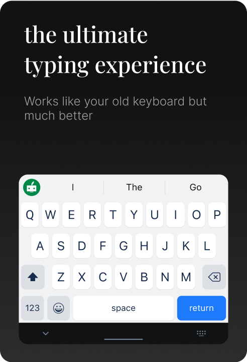
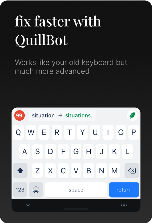
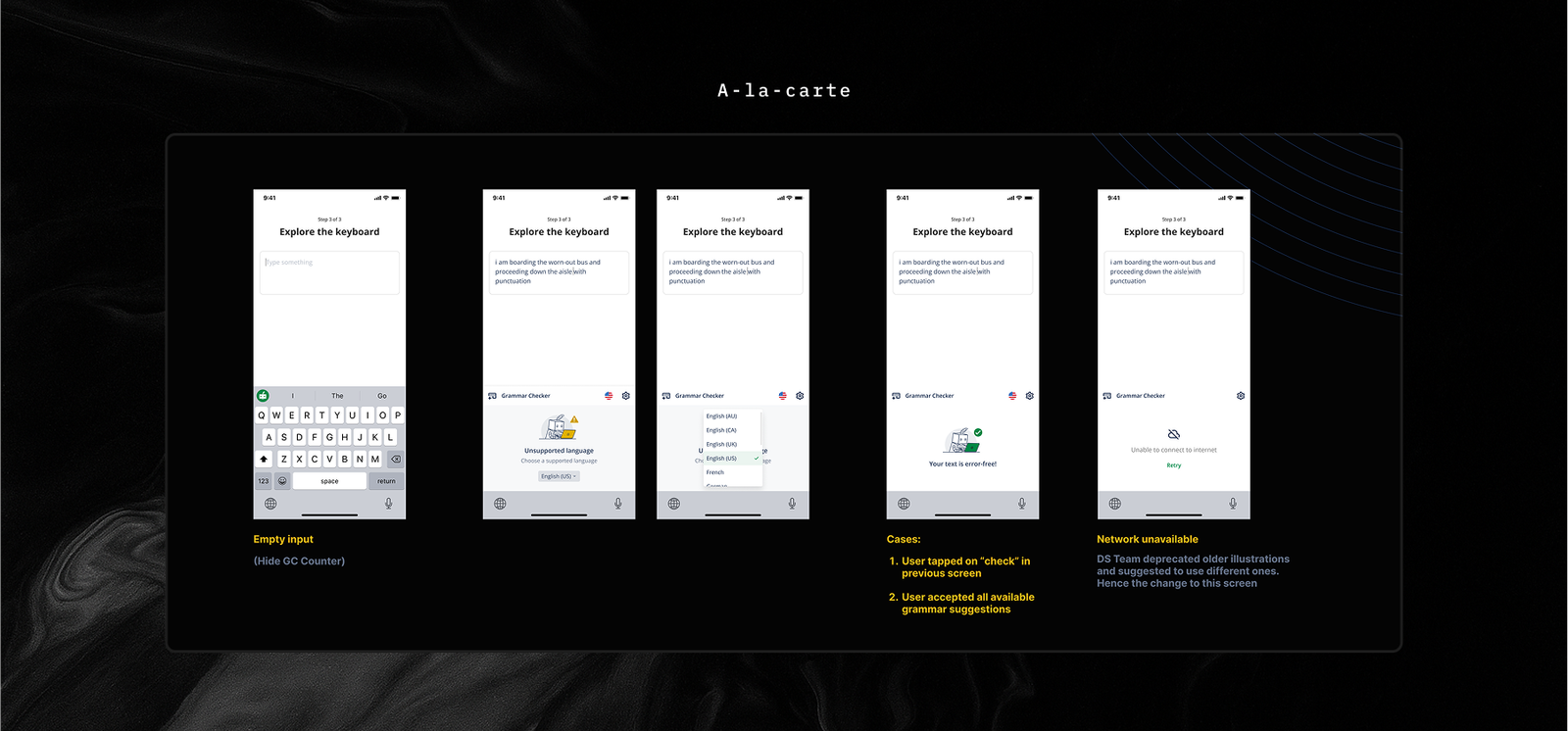
keyboard features
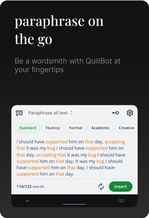
Paraphrase — 7+ modes — Custom mode
Adjust Synonyms — Grammar Suggestions — Auto Correction
Proactive Suggestions — Next word Predictions — Swipe Typing
Emojis — MultiLingual Support
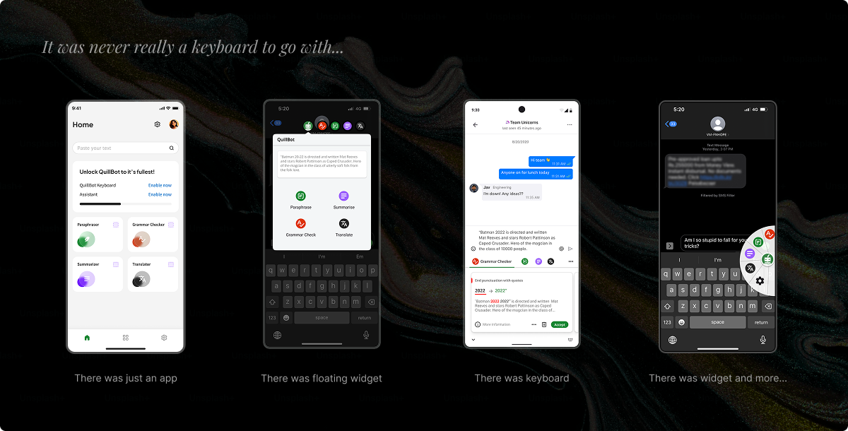
the opportunity
In a world where writing happens everywhere, the need for efficient, on-the-go tools has never been
greater. Through user feedback and research, we discovered a strong demand for mobile accessibility.
Traditional keyboards offered no rewriting, grammar, or contextual support — so we saw an
opportunity to bring QuillBot’s core strengths, like paraphrasing and grammar checking, directly to
mobile keyboards. Competitor insights validated this direction, showing how mobile integration could
elevate both user experience and brand loyalty. Our goal was simple: redefine mobile writing and
bring QuillBot’s trusted tools to where people write most.
“I love using QuillBot on my desktop, but I wish I could access it on my
phone for quick
edits.”
Switching between apps on mobile interrupts my workflow. I need
something
built-in and
seamless.
I’m always switching tasks—commuting, in meetings, or during short
breaks.
It’d be great
to
handle all my writing needs, from rewriting to fixing typos, without opening
multiple
apps.
When I’m on the go, I can’t always sit at my computer. It’d be a
game-changer
to
refine
emails,
messages, and posts quickly without worrying about grammar.
~ 6 billion
Total Addressable Market
50+ million
Existing QuillBot audience
2+ million
Existing QuillBot audience
50+ million
Existing QuillBot audience
What was my role?
Product Designer, Strategist, and Usability Evaluator
What did I work on?
Product Design, Strategy, Assisted in User Research, Visual Design,
Interactive Prototypes, and Usability Tests
What did I learn?
Design for Mobile Keyboards, Design a daily use product, Making mobile
writing better
What tools did I use?
FigJam (Brainstorming & workshops), Figma (Visual Design -
Prototyping
-
Dev hand-off), Google for secondary research
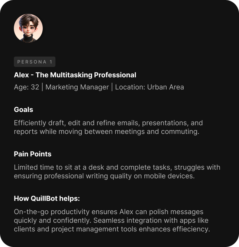
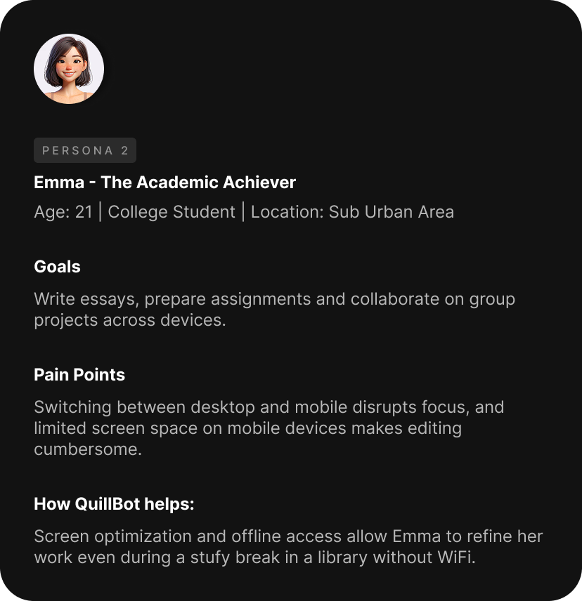
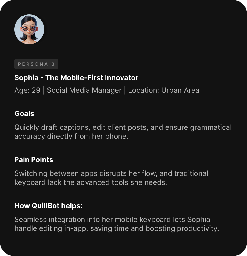
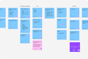
target audience archetypes
Understanding our users’ needs and behaviors was key to designing QuillBot’s mobile keyboard. Our
audience includes a diverse group of writers who use tools to boost productivity, creativity, and
communication in different contexts. These user archetypes helped us shape a solution that fits
naturally into everyday writing.
By identifying shared pain points and goals, we designed a product that aligns
with real habits and
expectations. Below is a summary of the insights that guided our development process.
insights from on-the-fly research
43.7%
43.7% of QuillBot users opt to write on their mobile devices when away from their
laptop
or
desktop, while 25% write exclusively on mobile devices.
> 70%
Over 70% of QuillBot mobile users are under the age of 24, with 18-24 year olds
forming
the
largest group of mobile users.
~46%
46% of surveyed users write professional documents using their mobile devices, which
is
higher than expected.
36%
of the global workforce works remotely, and U.S. freelancing is set to reach 50% by 2027 —
making mobile-friendly writing tools more essential than ever.
~ 6.8 billion
smartphone users worldwide as of 2024, representing nearly 86% of the global
population
55%
of global web traffic now comes from mobile devices, signaling a shift toward
mobile-first
engagement.
4.5 billion
Mobile app usage is expected to reach 4.5 billion active mobile app users by 2026
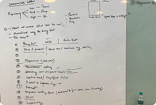
ideation
To integrate QuillBot’s big, fat, powerful tools into a mobile keyboard, we took a
collaborative
approach—sketching interface concepts, prototyping interactions, and refining solutions to
balance
user needs with technical feasibility, all within the constraints of a compact keyboard.
there were some obvious brainstorming sessions on:
- Tech feasibility
- Feature analysis
- User Journey Analysis
- Critique sessions
- Time to deliver
- and more
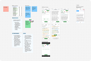
the
non-negotiables
of final design
Work for Contextual
Relevance
Show the right
tool at the right time, based on
user intent and input context.
Avoid over complicating
Keep
interactions simple and intuitive, even when
offering powerful features.
Every tap deserves a
response
Give clear
visual or haptic feedback to confirm
every user action is recognized.
Guide the flow
Ensure smooth
transitions between features without
breaking the user’s rhythm.
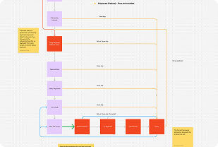
keyboard foundations
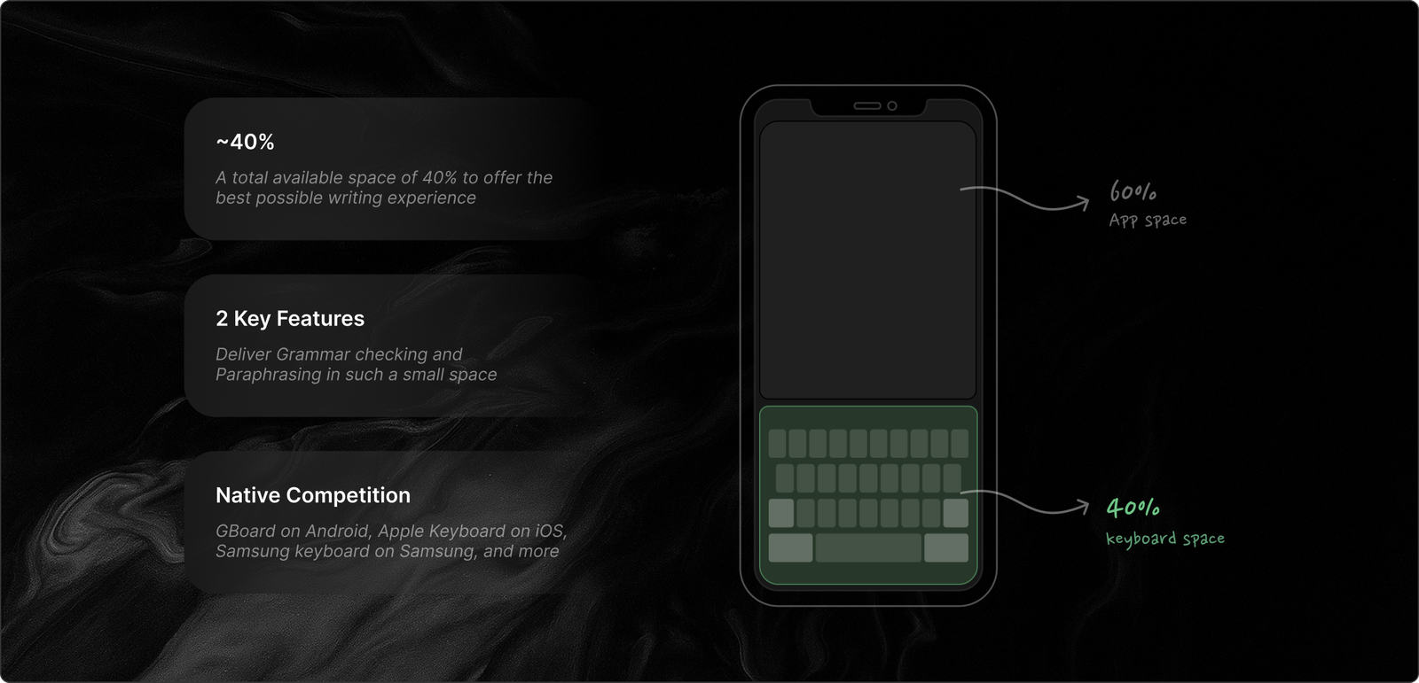
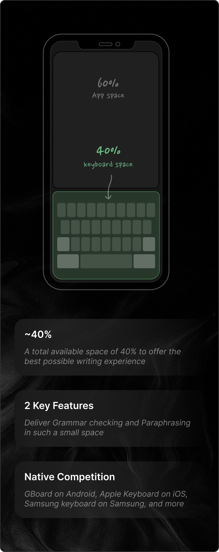
challenge
plugging massive paraphraser into a small keyboard
QuillBot’s paraphraser is a powerful tool designed to help users rewrite and refine text with
precision, offering a suite of modes, style options, and other advanced features. While
these
capabilities are seamless on a desktop interface, transferring them into the limited real
estate
of a mobile keyboard required rethinking and reimagining the experience.
Prioritizing Core Features
We focused on what mattered most to mobile users — paraphrasing and grammar checking. The
challenge was keeping them simple,
intuitive, and powerful within a small keyboard interface.
Balancing Depth and Simplicity
We offered just the right number of paraphrasing modes to cover key use cases. The result —
depth for those who need it,
simplicity for everyone else.
Streamlining Interaction Design
We used layered interactions. Power users could dig
deeper, while casual users stayed one tap away from quick rewrites. This kept the UI clean
and the experience effortless.
Navigating Technical Constraints
We optimized backend performance and
fine-tuned iOS and Android integrations to make rewrites fast, accurate, and seamless within
tight device limits.
Iterative Refinement
Continuous testing and real-world feedback shaped the product, ensuring it worked well in
real-world conditions.
Designing for Contextual Relevance
We built the paraphraser for everyday writing — emails, texts, and posts — with smart,
in-context suggestions.
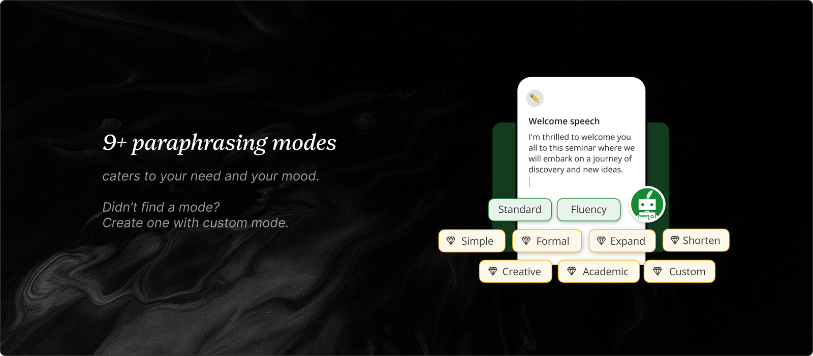
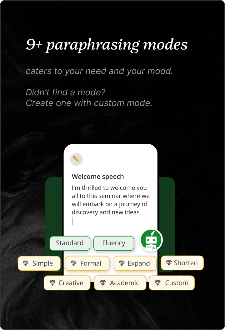
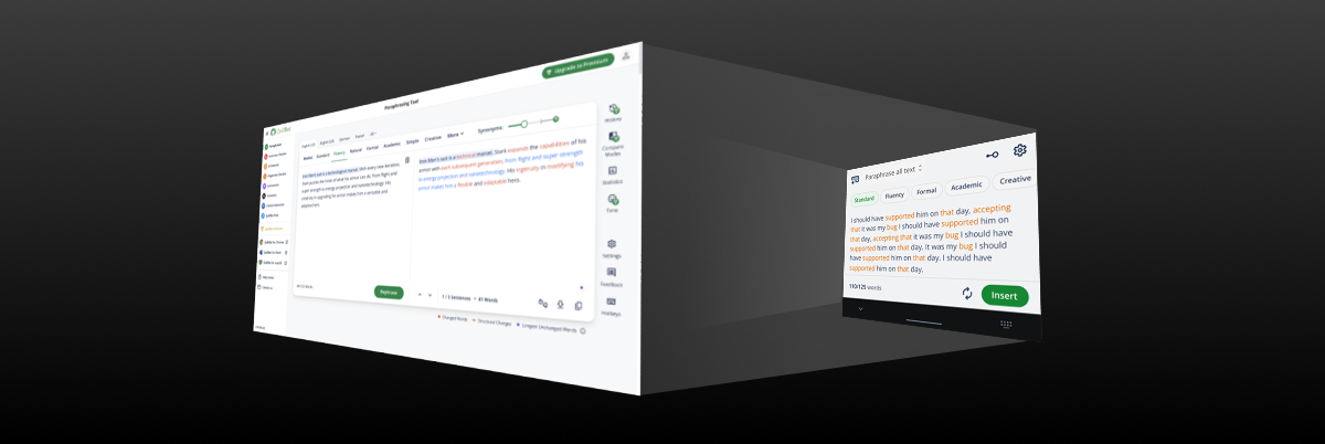
the custom mode paraphraser
QuillBot’s Custom Mode is where personalization meets precision. While preset modes like Standard,
Fluency, and Creative cover common tones, Custom Mode lets users fine-tune their own. Adjust
formality, creativity, or brevity to shape a style that matches your unique voice. Whether writing
for work, study, or self-expression, Custom Mode ensures your words fit the context — and feel
authentically you.
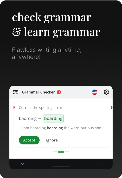
grammar checking at hand
QuillBot’s Grammar Checker is your go-to for clean, confident writing — wherever
you write. From emails and essays to quick chats, it catches everything from typos to complex
errors. Beyond fixing mistakes, it helps you learn through contextual suggestions, making every edit
a step toward better writing.
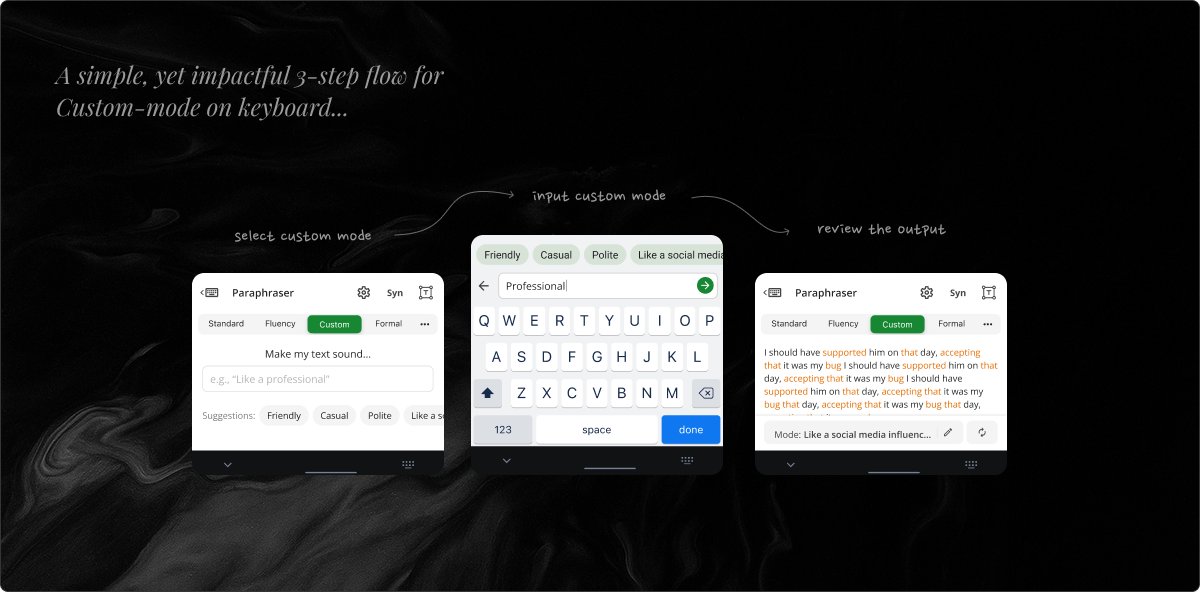
in-app purchases
Bringing QuillBot’s premium features to mobile meant rethinking how users upgrade on the go. We
simplified in-app purchases for a seamless, secure experience across Android and iOS — making it
effortless to unlock advanced tools anytime, anywhere.
Data in first 1 year
- Total conversions: ~11.5K | Majorly driven by iOS
- Avg purchases daily: iOS ~65 | Android ~18
- Conversion (from premium page): iOS ~9.78% | Android ~1.76% | WebApp
~6.3%
- Conversion (from any active user): iOS ~0.087% | Android ~0.015%
- Plans: 70% users are purchasing monthly plans
- Premium page shown immediately post login is the primary driver of conversion
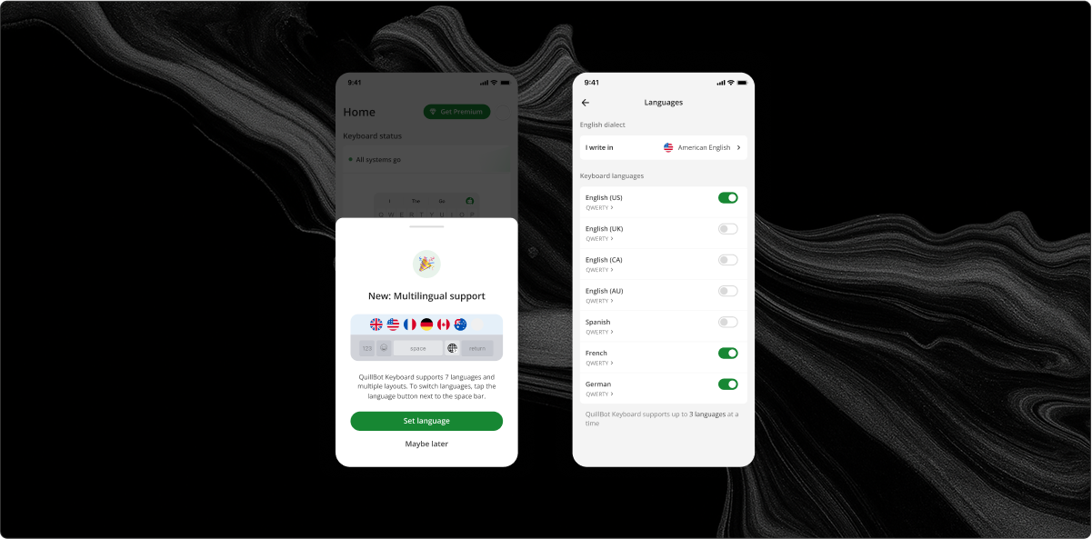
built for multi-lingual
Designing a multilingual keyboard meant creating an experience that adapts to diverse writing needs.
Supporting English, Spanish, French, and German — plus layouts like QWERTY and AZERTY — we focused
on effortless switching, helping users write comfortably in any language.
collaboration & wearing multiple hats
.png)
Throughout the product journey, I wore many hats — collaborating with product managers,
developers, designers, UX
writers, legal teams, and other teams to ensure the project’s success.
- Requirement refinement: Partnered with product managers to shape
requirement documents
and
define the project’s scope of work.
- User Research & Design: Conducted user research to
identify
pain
points and
designed
experiences that prioritized user needs.
- Visual design: Delivered visually engaging designs while
maintaining a
balance between
aesthetics and functionality.
- Technical explorations: Reviewed technical documentation to
understand
platform
limitations and
collaborated with developers to devise creative solutions.
- Usability Testing: Facilitated usability testing to validate
designs
and
ensure seamless
user
experiences.
- Cross-functional collaboration: Acted as a central link, fostering
collaboration and
alignment
across diverse teams like product managers, developers, core-design team,
design-system
teams,
UX writing teams, legal teams, etc. to maintain a cohesive vision.
This collaborative approach, paired with the flexibility to take on multiple roles,
helped
create a well-rounded product that aligned with user expectations and business
goals.
internal user testing & iterations
We began with extensive internal testing, gathering feedback to identify usability
issues and refine features. After launch, the iteration continued — blending internal insights with
real user feedback to fix bugs and enhance functionality. This approach helped the product evolve
into a seamless, reliable solution.
post launch user study
Understanding how people actually used the app was key to improving QuillBot Mobile after launch. We
gathered insights through in-app analytics, surveys, and app store reviews to see how users engaged
with features like in-app purchases and writing tools. This helped us spot friction, measure
satisfaction, and refine design choices — creating a smoother experience for our global audience..

download QuillBot Keyboard now!


.png)
.png)
.png)
.png)
.png)
.png)
.png)
.png)
.png)
.png)
.png)